Making Word documents accessible
Accessibility isn't just for websites. Documents such as Word files and PDFs should also be accessible so people with disabilities can read and use them. Following the Web Content Accessibility Guidelines (WCAG) is one of the best ways to achieve this.
Making a PDF fully accessible requires an Adobe Acrobat Pro license and some manual work. This can be expensive and time-consuming. However, making simple changes to the way you create documents can go a huge way, for free. This is the absolute minimum you should be doing for document accessibility.
Here, we’ll focus on accessibility within Microsoft Word. The same principles apply to Google Docs, PowerPoint, and other text editing software.
Contents:
Headings
Headings are used for two reasons; to make text easier to read and to allow screen readers to navigate. Screen readers use headings to navigate text. It is also important to split content up using headings as it helps readers scan the page and find information quickly.
You cannot simply bold text to make a heading, you must use the built-in header styles in Microsoft Word. If you just style your text to look like headings or subheadings, screen readers cannot tell the difference and will just read on through.
To add headings, highlight the text you want to turn into a heading and select the correct heading in Styles.

Headings must be used in the correct order:
The main heading, normally the page title, would be Heading 1. There should only be one Heading 1 used.
The next level, and the heading you’d use most, is Heading 2.
The subheading under Heading 2 would be Heading 3.
You can’t skip a level of headings, so Heading 3 would never follow Heading 1.
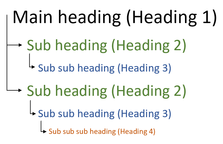
Word has pre-set styles for your headings. You can change the look of the headings in the Styles panel. Right-click on the heading and select ‘modify’. If you have already formatted your document, select ‘update to match selection’ and the heading style will be changed.

Alternative (alt) text
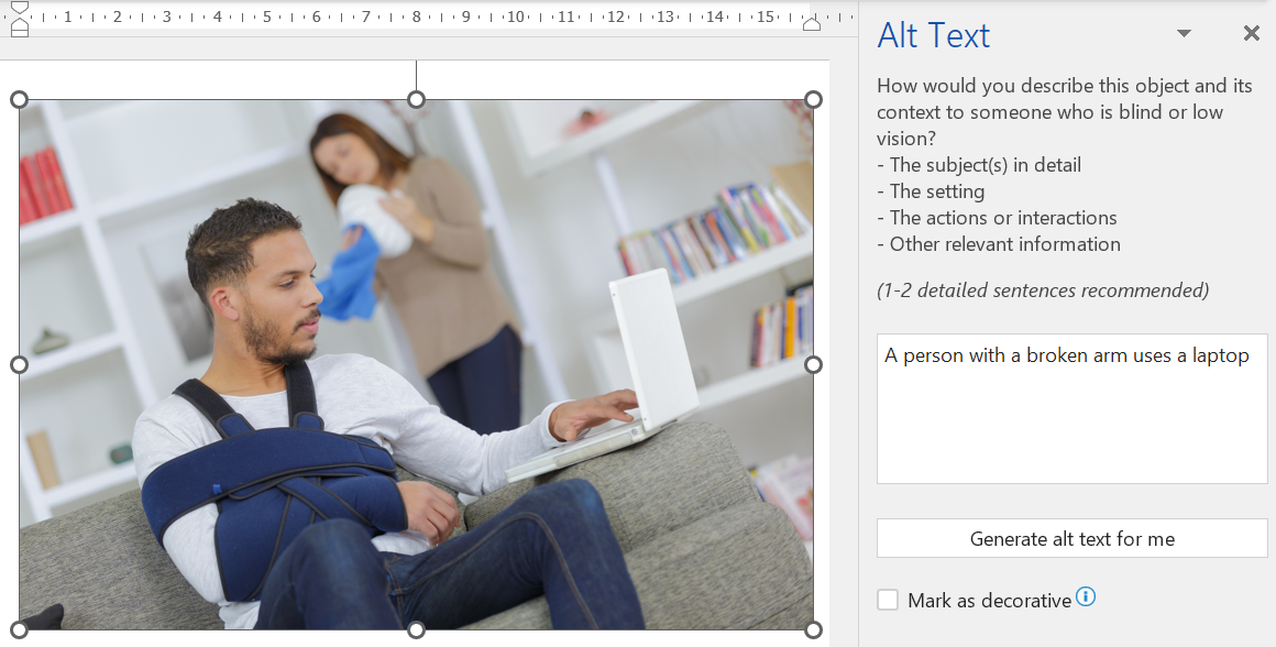
All images must have alternative (alt) text. Alt text is a description of an image which is read out by screen readers for those who cannot see them.
Imagine you're describing the image over the phone.
Don’t go into too much detail if it isn’t relevant.
Think about context. A group of people at a funeral would be described differently than a group of people at a party.
If an image contains text, write the text out in the alt text. In general, avoid having text in images.
If the image is only decorative and serves no purpose, the image must be marked as such.
To add alt text, right-click on the image and select ‘edit alt text’. Either add alt text in the box or tick the ‘mark as decorative’ checkbox. Decorative images are skipped by screen readers, so this is useful for things like lines, borders and other decorative graphics.
Note; some older versions of Word do not have the ‘mark as decorative’ option.
Colour contrast
If you are using colours in the document, as text or background, they must have sufficient colour contrast for people with vision impairments. Around 1 in 12 men and 1 in 200 women have some degree of colour vision impairment and they may not be able to read your content.
Use the Web Aim colour contrast checker to check if you have sufficient contrast. You should have a contrast ratio of at least 4.5:1.

To get the hex colour code, open the colour palette, click on ‘more colours’ and go to the second tab ‘RGB sliders’ – it is the number with # in front of it.
Use of colour
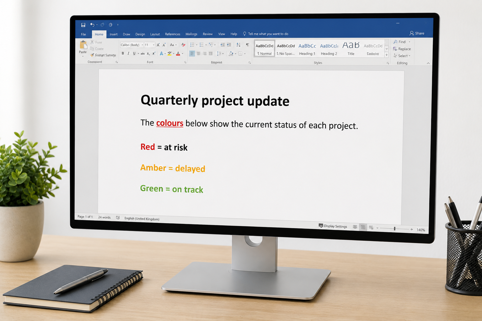
Do not rely on colour alone to explain information. For example, avoid saying "the text in red is important" or "the green boxes show completed tasks" unless there is another way to identify them. Some people may not be able to see or tell the difference between colours. Use text, icons or labels as well as colour, and make sure there is enough colour contrast between the text and background so it is easy to read.
Lists
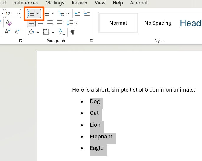
Use Word's built-in bullet points and numbered lists instead of typing hyphens, asterisks or numbers yourself. This helps screen readers recognise the content as a list and read it correctly. Use numbered lists for steps that need to be completed in order, and bullet points when the order does not matter.
Tables
Only use tables to present data. Do not use them to control the layout of your document or for decorative purposes. A good way to check whether you need a table is to ask yourself if you can add a heading row. If you can't, you probably shouldn't be using a table.
To add a heading row, select the table, go to Table Design and make sure Header Row is checked.
Tables should also:
Have no merged cells
Have no blank cells
Include a short description before the table so people using screen readers can decide whether they want to read the table or skip it

Accessibility check
As a final check before saving, use the Word accessibility checker to search for any issues. Go to Review > Check Accessibility and it will perform a check on your content. If there any any issues, Word will provide instructions on things you need to fix.
The Accessibility Checker is a great place to start, but it doesn't find every accessibility issue. For example, it cannot tell if your headings are correct or whether your images contain text.

Saving as PDF
Avoid using Word docs for your documents. PDFs are better for accessibility and often formatting can be lost when opening Word documents in different programs.
To save as a PDF, select File > Save As Adobe PDF. The wording may vary depending on the version of Microsoft Word you are using.
Remember, this is just the basics. These steps do not mean the document is completely accessible but it is a big step in the right direction.
You can not simply rely on the Acrobat accessibility checker or other automated tools. Although they will highlight some issues, like missing alt text, it is an automatic check and can not see all issues.
We offer accessible document training or can make your documents accessible for you. Get in touch to find out more.